Sharing stories from other jurisdictions to see if there may be ideas for our public transportation system. For informational and discussion purposes
The Making of the L.A. Metro 'M'
A story of deli counters, legal threats, and hidden meanings—in one letter.
- ERIC JAFFE
- @e_jaffe
- 10:25 AM ET
- Comments

Michael Lejeune, creative director for the Los Angeles Metro, still remembers when the bell tolled for the transit agency's design jobs. Literally. There was a counter and a bell at the entrance to the graphics department, and when other Metro employees needed a hand with something creative, they'd stop by and make a request like so: Ding! I need a brochure!
"The first thing we did was blow up the bell and remove the counter," says Lejeune, who arrived at Metro 14 years ago in September. "We're not a deli."
So began the rebranding of L.A. Metro, a long-term mandate Lejeune has described as making public transportation in Los Angeles "cool" again. The newly established in-house design team, which included art director Neil Sadler, transformed Metro's image piece by piece from there. Their first task was infusing the bus fleet with color—"Why would we want to be invisible on our own streets?" says Lejeune—and a few years later they took on an even more ubiquitous symbol of Metro service: the agency's "M" logo.
After our recent post on 77 different ways metro agencies design their "M" logos, CityLab asked Lejeune to tell us the story of how L.A. made its own little letter unique.

Cease and desist
The L.A. transit system's previous logo was a block "M" with soft corners embedded in a circle above the word "METRO" in all-caps (left). The image was simple enough, but the agency used it inconsistently, says Lejeune, recalling one rail station where it appeared in both red and blue variations. A bigger problem was that the word "METRO," tucked beneath the "M" in such a small font, became hard to read at certain sizes or from far away.
Then there was the letter from the Washington, D.C., transit agency—another system whose logo used a block "M" above the word "metro"—saying (at least by Lejeune's recollection) that L.A.'s logo came too close to its own copyrighted version. "We needed to basically cease and desist on this logo, because it was too similar to theirs," he says. "It really opened up the door for us to be able to explore the idea of a new logo."
(A Washington Metro spokesperson tells CityLab that "several years ago" the agency did object to an L.A. transit logo it considered too similar to D.C.'s trademarked version, but never filed a lawsuit.)
So, in 2003, Lejeune and Sadler got to work on a new "M" for L.A. They wanted to keep the basic scheme of the "M" inside a circle, as local surveys showed about an 80 percent recognition of the Metro logo, and of course there's also some universal appreciation that an "M" stands for Metro. But even with those same basic elements in place, the new logo would still have to distinguish itself from every other "M" out there and become the identity of the new agency brand.
"The purpose of the logo is to say, 'This is a Metro thing,'" says Lejeune. "Everything you feel about Metro comes into play once you know it's a Metro thing. That's what logos for the most part do. They identify who is speaking."
What that notch really means
Lejeune says the team had narrowed in on two options within a couple weeks. The logo that was ultimately approved by the Metro board is a block "M" with hard edges embedded in a circle, with a vertical-diagonal notch splitting the letter in two. (Lejeune describes the one that lost out as "kind of similar" but with the stems of the "M" looking "sort of like popsicle sticks.")
The notch does separate L.A.'s "M" from other designs, but Lejeune says it isn't just for show. Rather, the idea was that splitting the letter reflected the agency's dual mission: on one hand Metro is a transportation provider, and on the other side it's a planner and visionary for L.A. mobility. "The thought with that 'M' was it's two sides of the house, and they come together, and it's a holistic circle," he says.
The decision to deprive the new logo of any color was deliberate, too. "We needed the logo to communicate strength and consistency and always be the same and not be different colors," says Lejeune. "We were reestablishing reliability and the consistency of our service to our customers." As a result the logo only appears in black and white.
Then there was the word "Metro"—bumped out in the new design to appear beside the "M" as much more of an visual equal partner. The move reinforced the agency's preference to go by "Metro" and not by its official name, the Metropolitan Transportation Authority, or by the acronym MTA. "The 'A' is 'Authority': Who needs that in name when you're talking to customers?" says Lejeune. "'Metro' tested higher. It also put us in that same league with the big systems around the world."
95 percent recognition
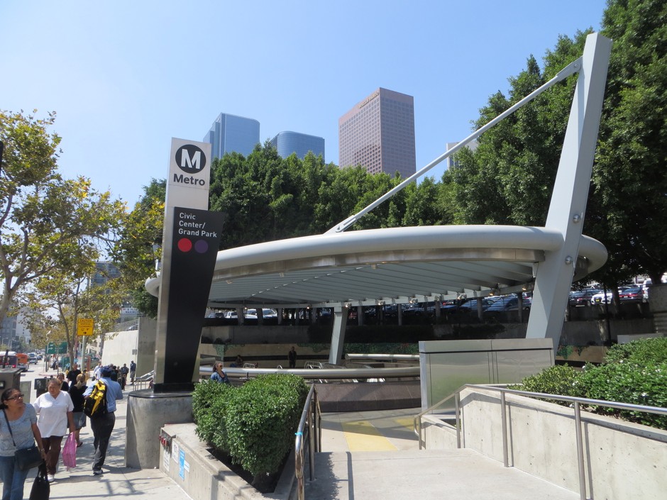
The new logo now has a 95 percent recognition rating with the city, according to Lejeune. Though the original idea was to keep "M" and "Metro" as a logo pair, the agency has started to uncouple the two elements in the past few years, he says, because both have become "synonymous" with city transit. "There's enough awareness that we can use one or the other interchangeably," he says. "Now we tend to use the M in the circle more on its own."
Looking back, Lejeune appreciates that the creative team didn't spend an eternity crafting the logo. Once in a while a logo can take on a life of its own (Lejeune offers the Nike swoosh or the Coca-Cola letterform as examples) but he says that's rare in general and even more so in transportation (the Transport for London roundel and the FedEx logo being exceptions in his mind). That time was better spent reimagining the rest of the agency in the new Metro spirit.

"Let's lock that down and move onto what matters—our message, our story, our voice—and reengage Los Angeles," he says. "That's what we've done."
He's also pleased that design is no longer an afterthought at Metro. Recently asked during a staff meeting what he's most proud of during his time on the job, Lejeune says his reply was that "we built design into the DNA of this agency." Creativity is now part of Metro's public persona from the logo on down. "Everything is designed," he says. "We're now generally at the table at the beginning of the project and all the way through."
No bell required.
_____________________________________
GNYAGG
(Call us "g-nag')
The Greater New York Avenue Gateway Group, Inc.
.
Driving Ideas, Collaboration, Opportunity, Creativity, Partnerships, Information, & Innovation to Make a Great Washington, D.C. Greater, Extraordinaire
with Signature Gateways/Hubs & Exemplary Schools, Housing, Businesses, & More
For a vibrant, family/age-friendly, economically and culturally diverse, welcoming global Nation's Capital to live, do business, work, and envoyDriving balance, ideas, collaboration, opportunity, technology, innovation, and information and preserving cultural assets/icons
GNYAGG serves as a convener, catalyst, change agent, leader, and principal voice to enhance, promote, protect, and connect the Corridor and Beyond and preserve and protect cultural assets/icons, and address issues impacting the future of the District of Columbia, Corridor, Gateways.
greaternyavegatewaygroup@gmail.com
http://greaternyavegateway.webs.com/
Follow us on Twitter: @gnyagg
Boundaries for Greater New York Avenue Gateway Corridor (Capital Arbor Way) are: From DC/MD border (includes Anacostia River and Eastern Avenue) on the east to North Capitol Street to the west, from Benning Road and H Street to the south to Rhode Island Avenue to the north.
0 comments:
Post a Comment